
#TuckedInCottageOnBunkerHill: Part 2
year: 2022
type: residential
designer: S.Flynn
style: modern, inviting, natural
We are back again with another portion of Kyle's and my home. In Part One we talked about the Entry Way, Mudroom, and Laundry Room. If you missed that one you can read about it!
We will now be moving into the Kitchen, Pantry, and Living Room areas.
To give a little recap of this project, we purchased this house knowing it was going to be a fixer-upper. We also knew that it was going to be a risk and that we would potentially run into more problems and issues than we originally had thought. We ended up tearing down most of the house and basically starting from scratch, but still kept the main footprint. It is a small space and we tried doing everything we could to make it seem open and bigger than it actually is.
As you are reading this blog series I want you to keep in mind that this is our personal home and our budget is not the same as our clients, so I am sharing a few ways we choose to cut and or save on budget!
I hope you enjoy Part 2 of Tucked In Cottage on Bunker Hill!
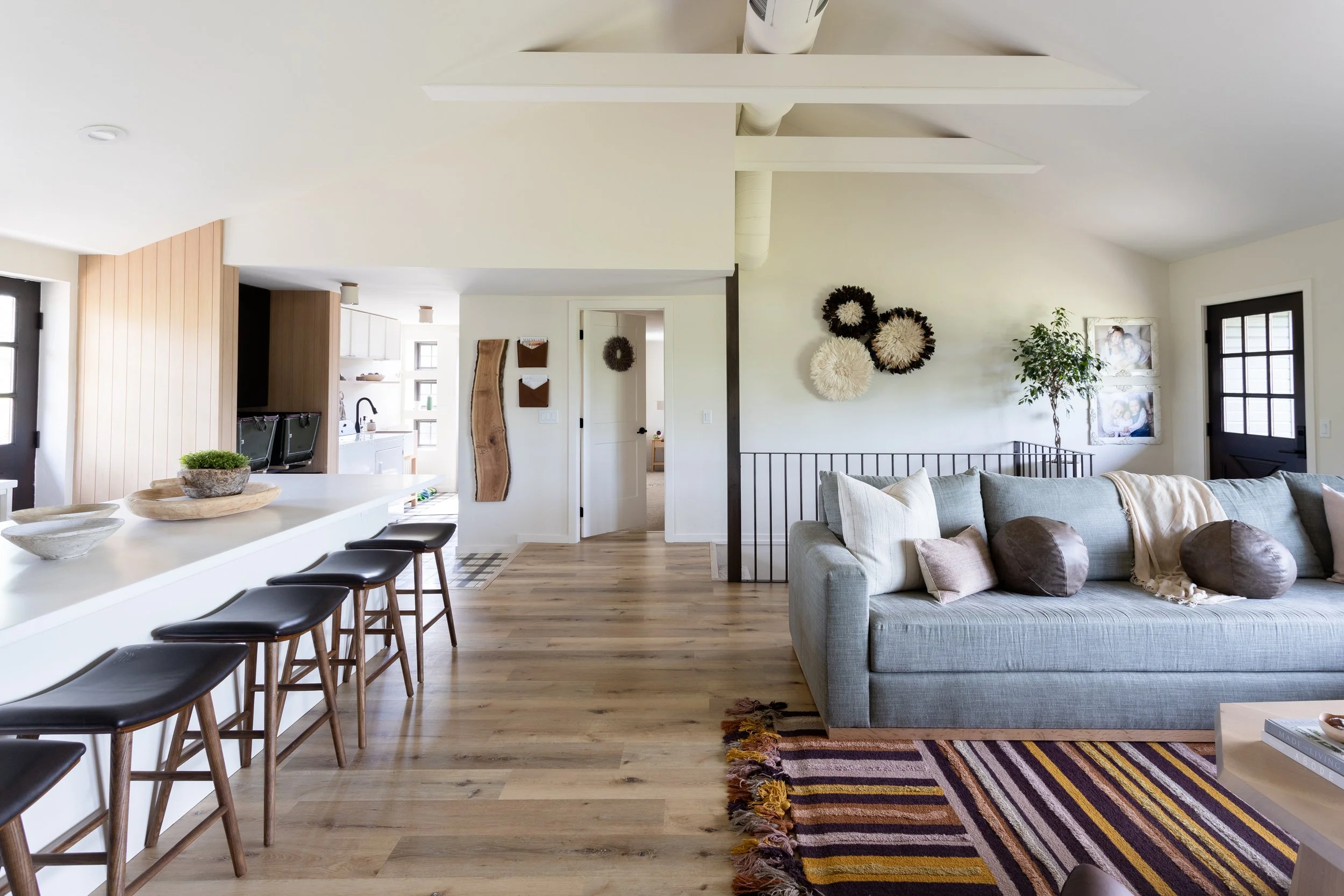
The first thing we did with this space was rotate the staircase 90 degrees to go against the wall. The stairs use to divide the kitchen and living room areas in half. We wanted to open the whole space and make it feel like the stairs were in a more practical location.
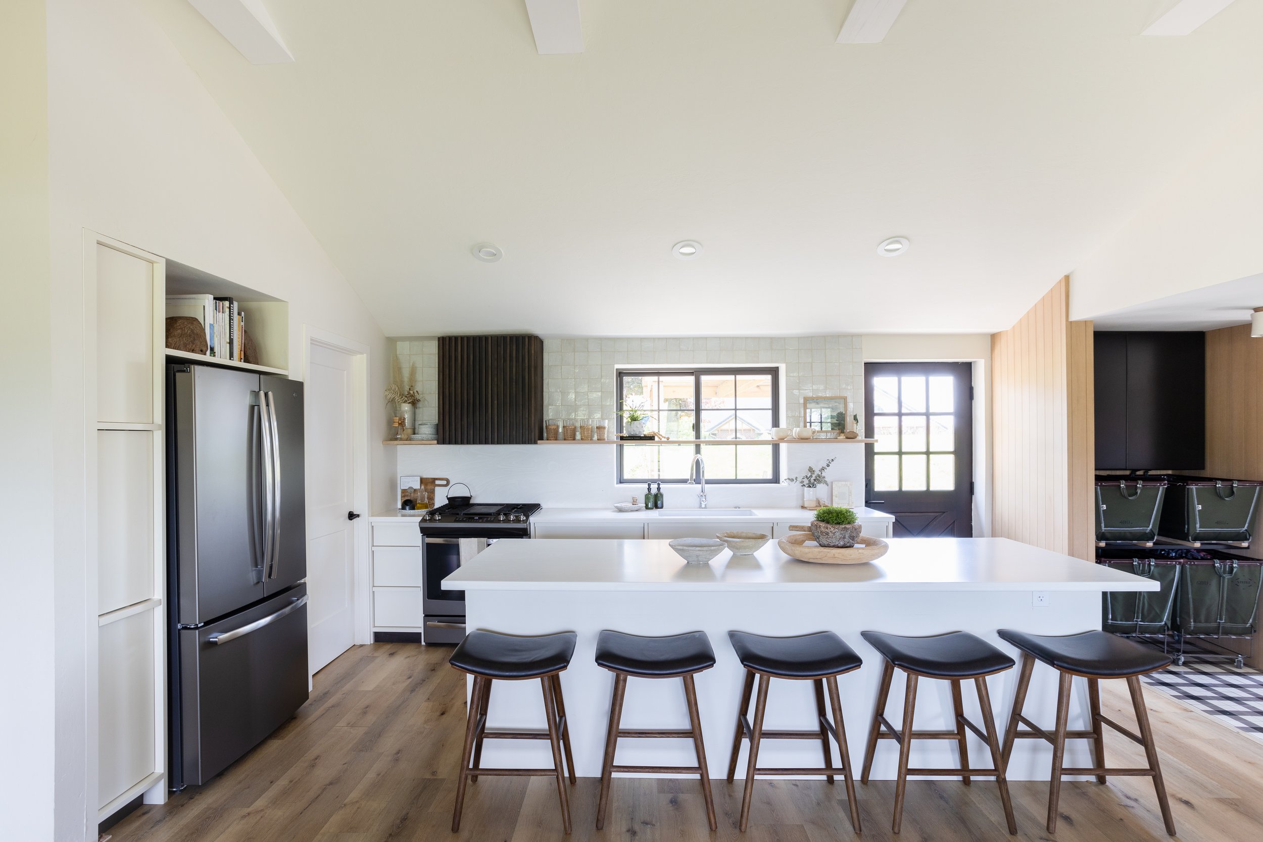
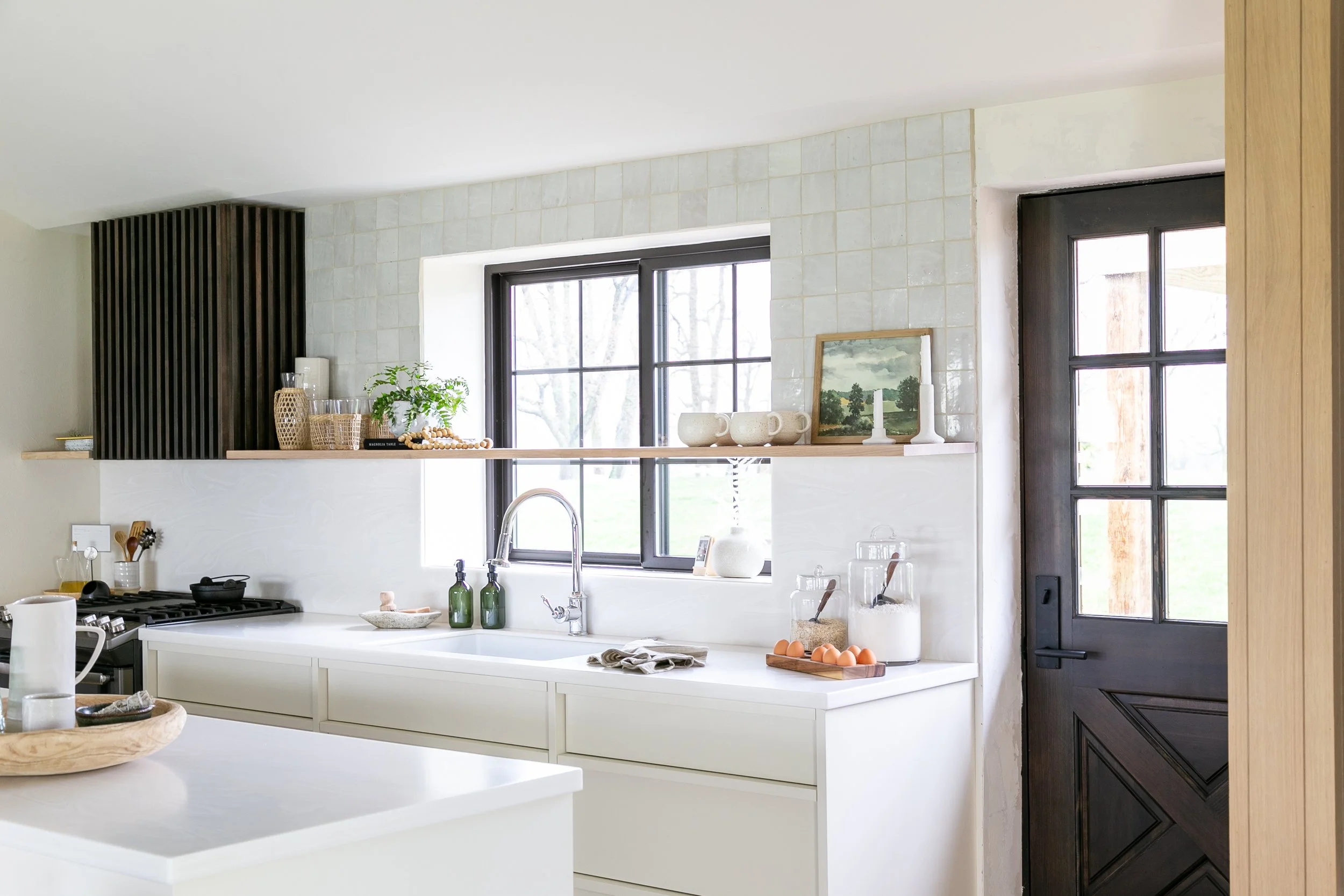
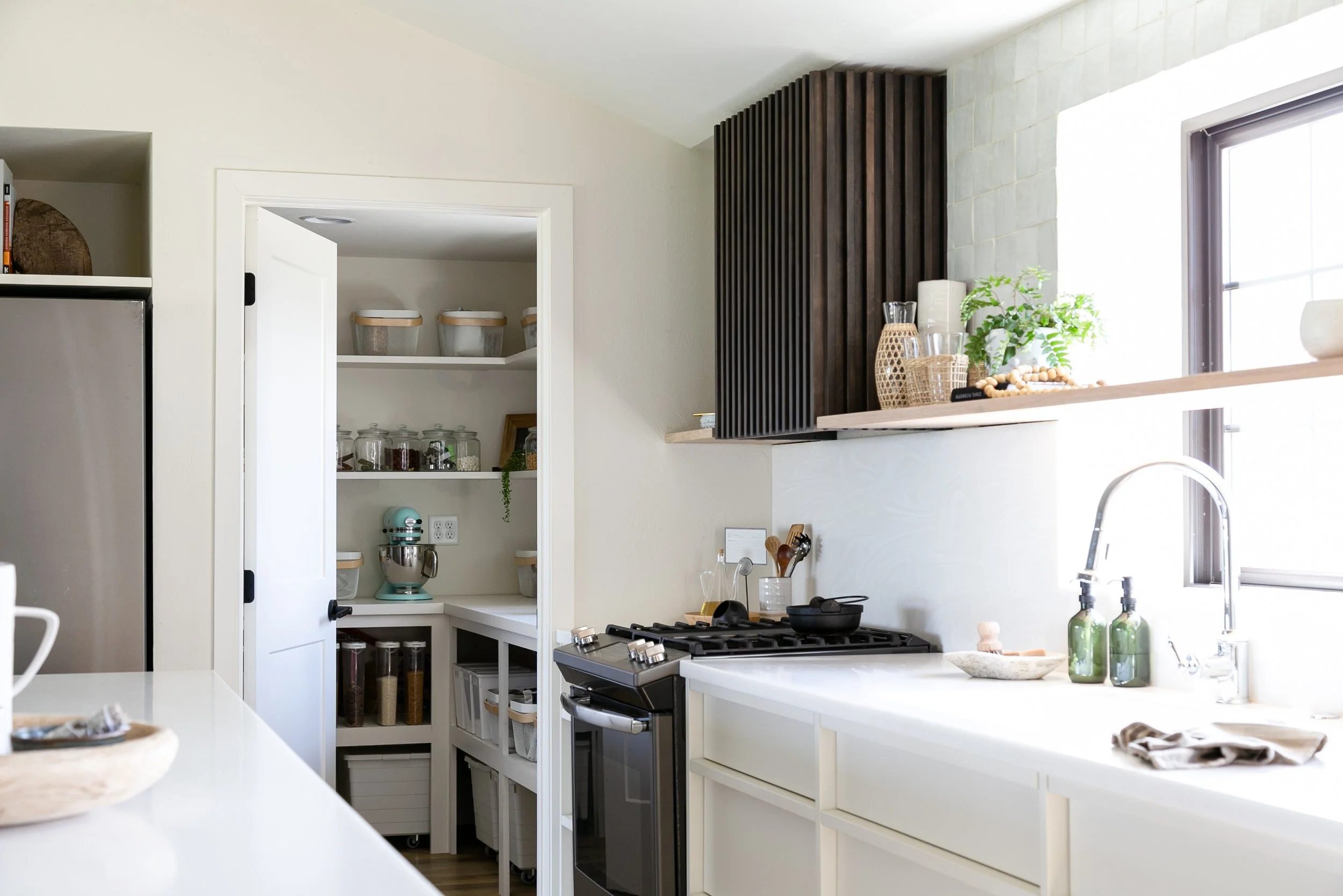
For the design of the kitchen, my personal esthetic is more monochromatic and neutral. Everything was based around the same color, so to create visual interest I added texture. For the cabinets I wanted a contemporary cottage feel and to accomplish that look I went for built in cabinets that look sleek with integrated pulls. I love hardware so I didn't even give myself an option of picking any, I just eliminated that all together.
For the backsplash I love the modern look you get when you pull your countertop up into the backsplash. For small kitchens like this one it is great because it also helps expand the space. I did this for half of the backslash and for the other half I used Zellige Tile. I love the texture you get from this tile and it is also very pretty without being too dominant.
To stay frugal in one area of the kitchen we decided to go with a solid surface choice of Corian rather than a natural stone for the countertop. We went with a light color which helps hide scratches.
Because the space is small and we have low ceilings I did not want to add upper cabinets that protrude into the space so I added a floating shelf. Again, we do not have the ceiling hight here, so I used just one floating shelf a little higher than the standard 18" above countertop in lieu of a few floating shelves.
Lastly, the hood. I needed something visually dominate to weigh down the space so I designed this dark hood that connects your eye to the dark toe kicks, barstools, and door. I love the modern detail with the repeated 1" square pieces.
Kitchen
01.
Pantry
02.
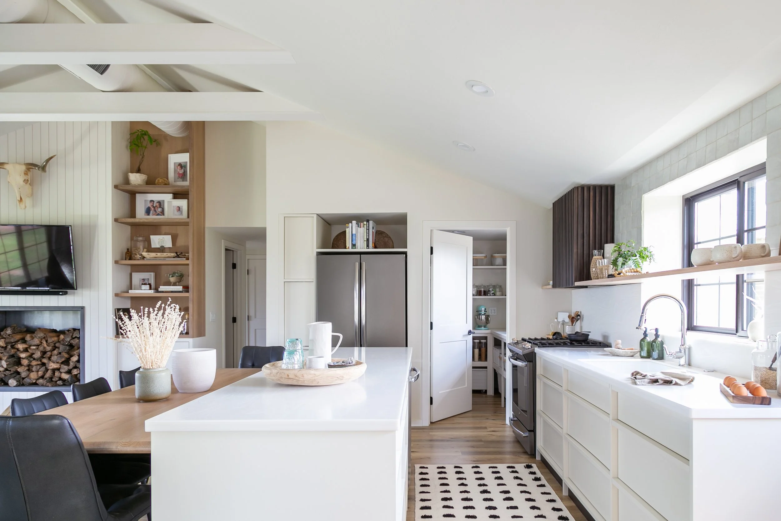
This area right off the kitchen used to be the only full bathroom in the house. Because the kitchen itself is small and to make it work more for a family the best solution for our family was turning the bathroom into a pantry.
We packed a lot of storage into this area due to the fact we did not have room in the kitchen for cabinetry. We chose to face frame our cabinets and install floating shelves, all painted white to keep the space looking and feeling clean. Again, we needed to try and save where we could and by using the face framing install this was a way to save instead of installing built in or custom cabinets.
Living Room
03.
In addition to a casual seating area, we also wanted to incorporate a more elevated dining space. We used an inexpensive table base created by a local metal shop and black honed granite slab as the tabletop. (This is a really easy DIY if you’re struggling to find an outdoor dining table within your budget!)
To keep the design cohesive with the rest of the outdoor space, we selected affordable dining chairs from Target that coordinate with the fire pit chairs, added a modern, neutral planter from S. Flynn Home, and hung some fun cafe lights that set the mood.
Our home is located on a long, flat ranch, so to create some visual interest in the backyard, we raised the dining area on a wood platform and covered it with a tall, jet-black pergola. Nearby, we added a kid’s table from Ikea that we cut down to a suitable height.
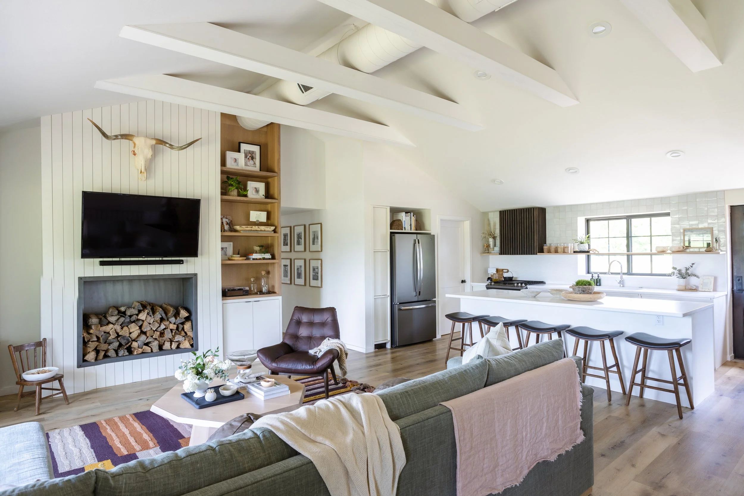
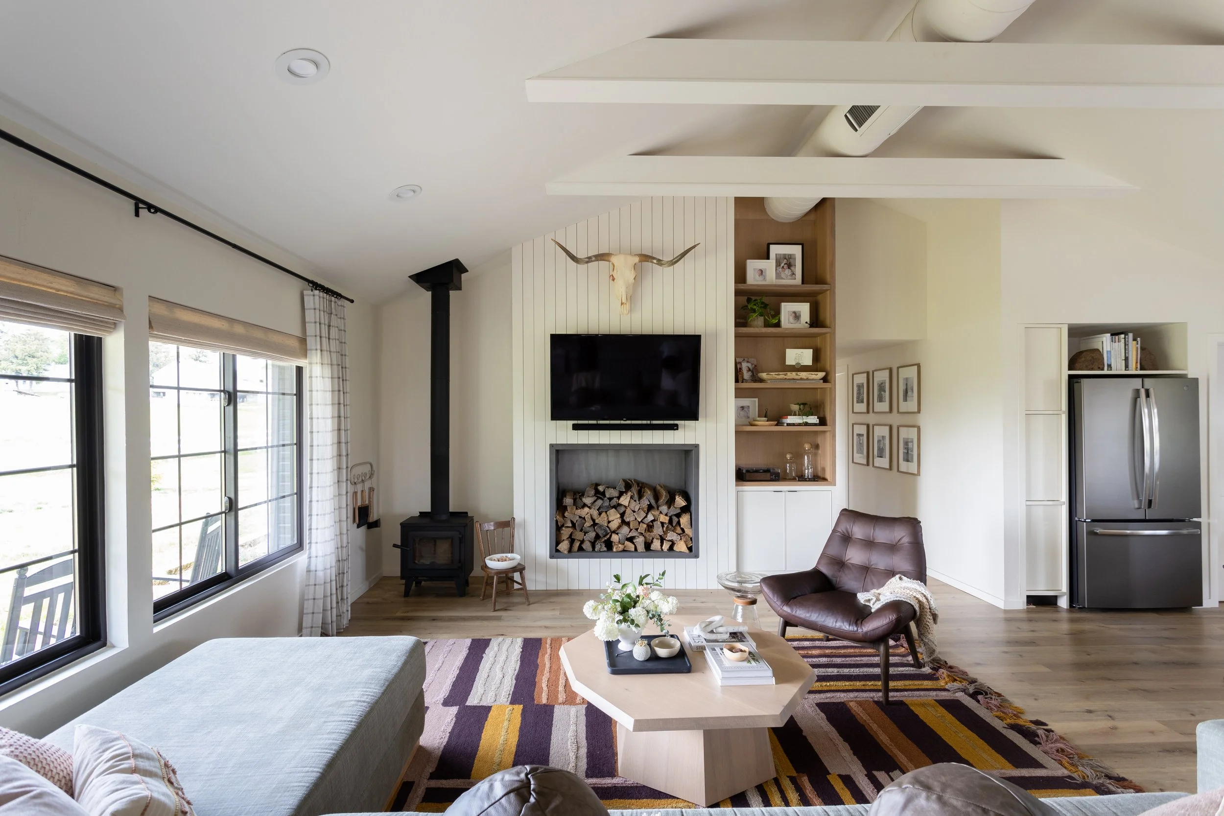
Fireplace: At the this point the best thing the house had going for it was the high ceiling in the living room so I drew attention to this with the 4 inch slat wood detail where the TV is located. There was an existing fireplace in this area, but it protruded out to the living room too much so we decided to take it out. This gained us 3 more feet of living room space. Kyle and I love having a real fire, so to replace what we had taken out we went for a more frugal option and got a wood burning stove. By choosing a wood burning stove over a custom built in fireplace, we were able to save around $5000.
We now needed a place to store wood, which I suggest in any design when you are dealing with a real fireplace, because wood is messy. I love the look of displaying the wood in a way you can see it because it helps add texture and character to the room. We installed a heat rolled steel with a matte finish for the insert and also used this material for our basement stair railing located in the back of the living room.
Above the TV is a European Mount Longhorn. A little explanation to this funky design element is that I’m married to a cowboy. This mount actually came from Kyle's family farm. One winter a few long horns died and Kyle got the mount made, so having this in the house makes for a special little detail.
The tall bookcase is white oak and helps add some visual interest and draws your eye up. I chose white oak to help tie in the other white oak accents through out the home, specifically the flooring. The base cabinets underneath have the slim shaker profile that is also in the laundry room.
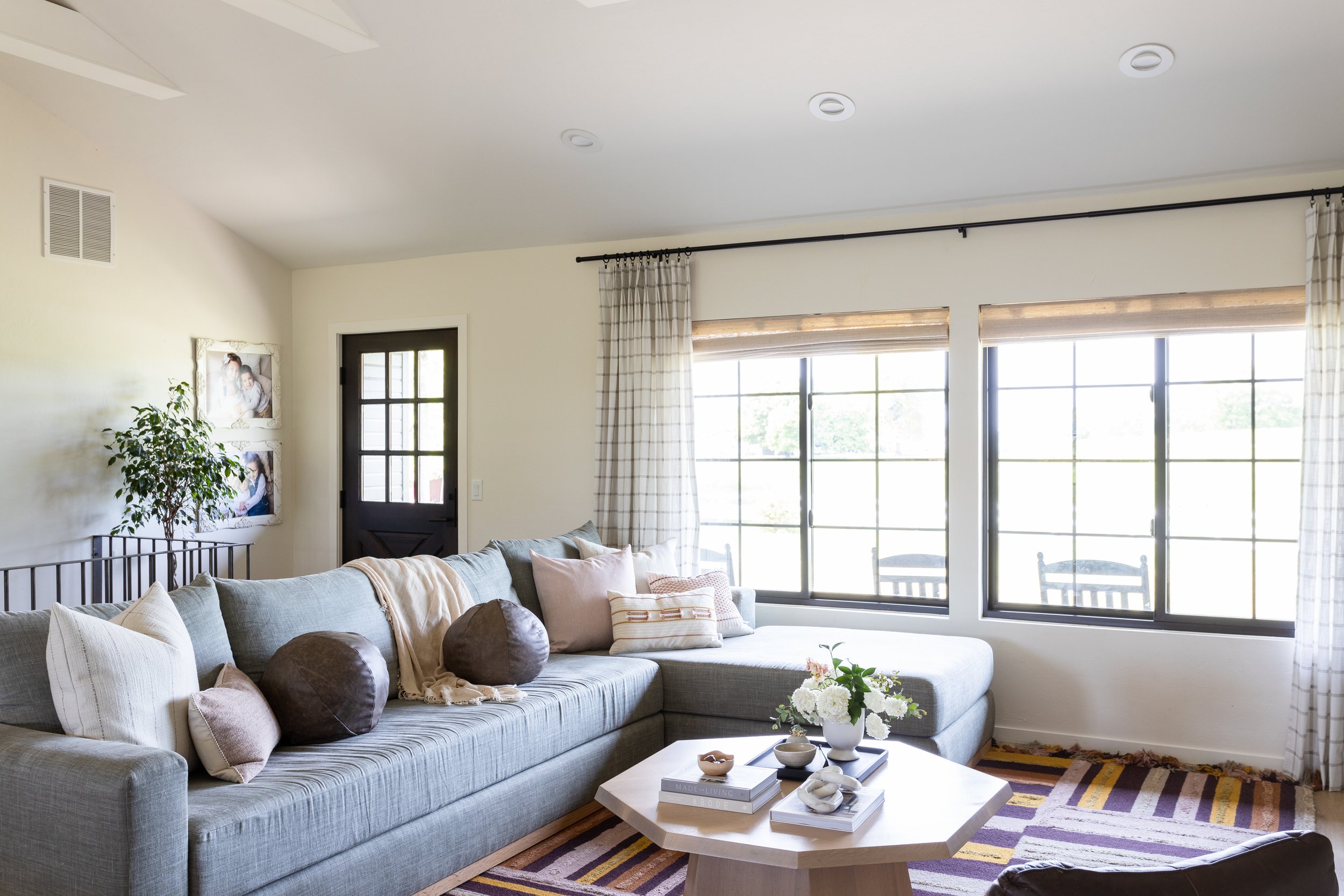
Living Room: Furniture My green linen custom sofa is one of my favorite things! Especially, the fact that my whole family can lounge on it!
I love the look of green and blush paired together so I brought that in with our wool and viscose rug from Loloi. I felt bad adding too much pink because I wanted to keep the design masculine for Kyle, so I like that rug has brown in it. It also paired great with the rich leather side chair!
For flooring throughout the kitchen, pantry and living room I wanted a blond oak floor. As mentioned multiple times before, we needed to save any way we could and this was a hard one for me because I love custom hardwood flooring! To be more frugal we opted for LVT tiles because the labor/install cost is about half compared to hardwood floor. Even though I didn't get the real hardwood, the LVT is still so beautiful and created the look I was going for.
I hope you enjoyed Part 2 of Tucked In Cottage on Bunker Hill!
Don't forget to sign up for our email blast to be the first to hear about our New Project Reveals!